
Plush
BRANDING PROJECT
Where rest becomes ritual.
Plush originated as a self-promotional branding project completed during my senior year in a graphic design course. The assignment challenged me to develop a comprehensive visual identity system grounded in my personal creative values and professional aspirations.
The objective was to build a cohesive and strategically driven brand that authentically represents who I am as a designer. This included creating a fully realized identity with thoughtful extensions across print and promotional materials, all unified through a detailed style guide. The project demonstrates my ability to translate conceptual thinking into clear, compelling visual communication while maintaining consistency across multiple touch points. For my project, I wanted to frame self-care as essential for high achievers. I strive to take excellent care of myself and want to help others do the same. I created this brand to challenge the culture of burnout and position rest as a deliberate, aspirational ritual.
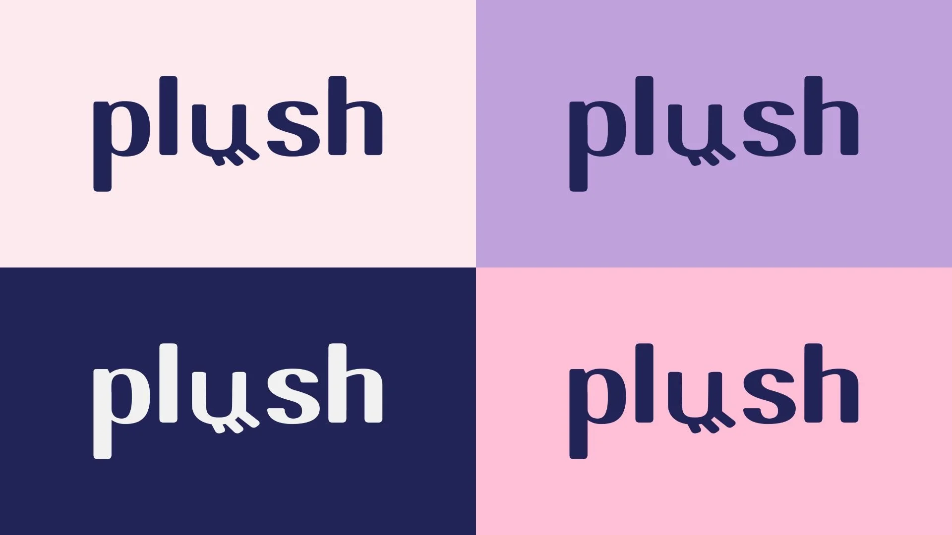
HORIZONTAL LOGOS
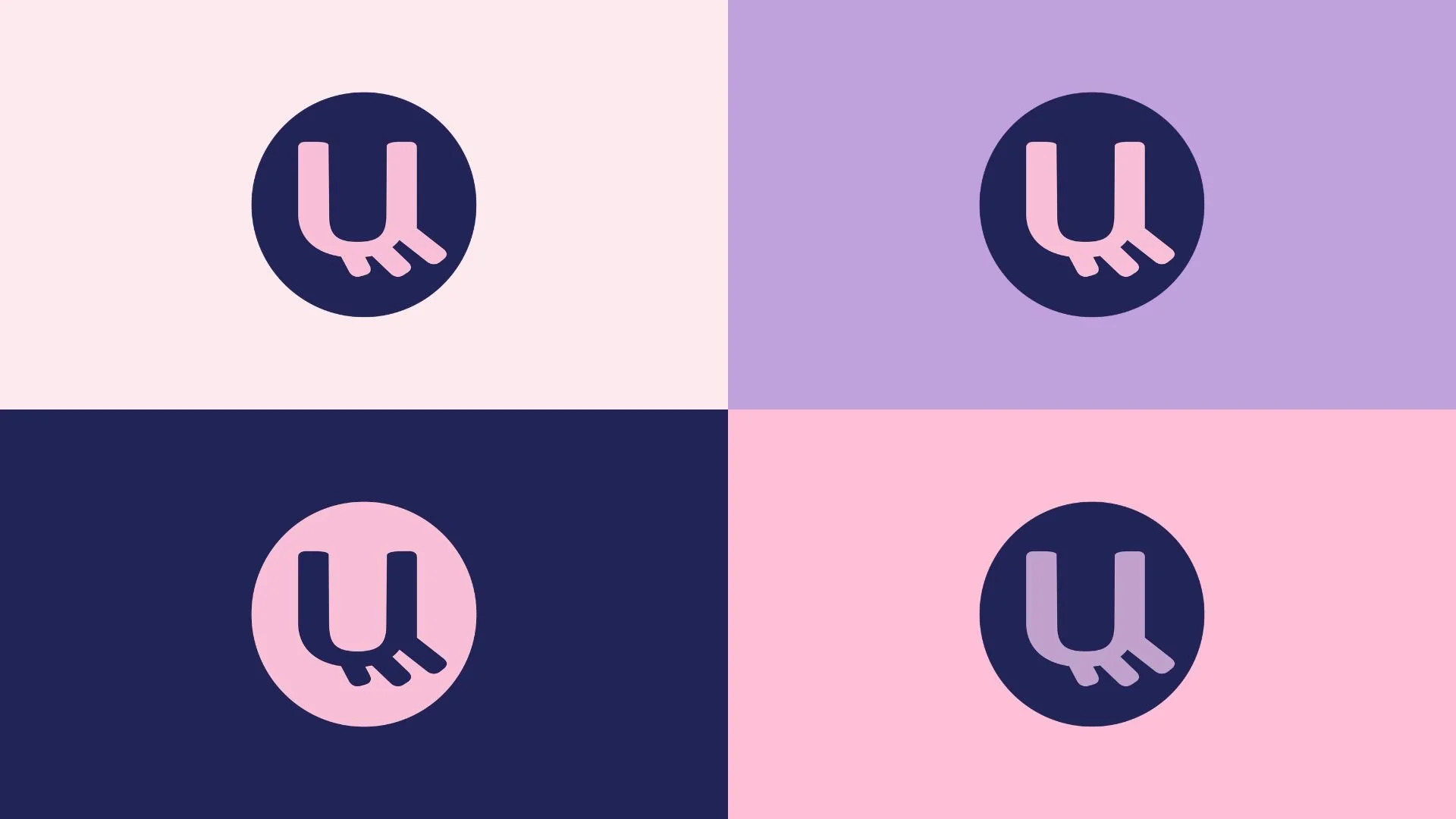
SUBMARK LOGOS
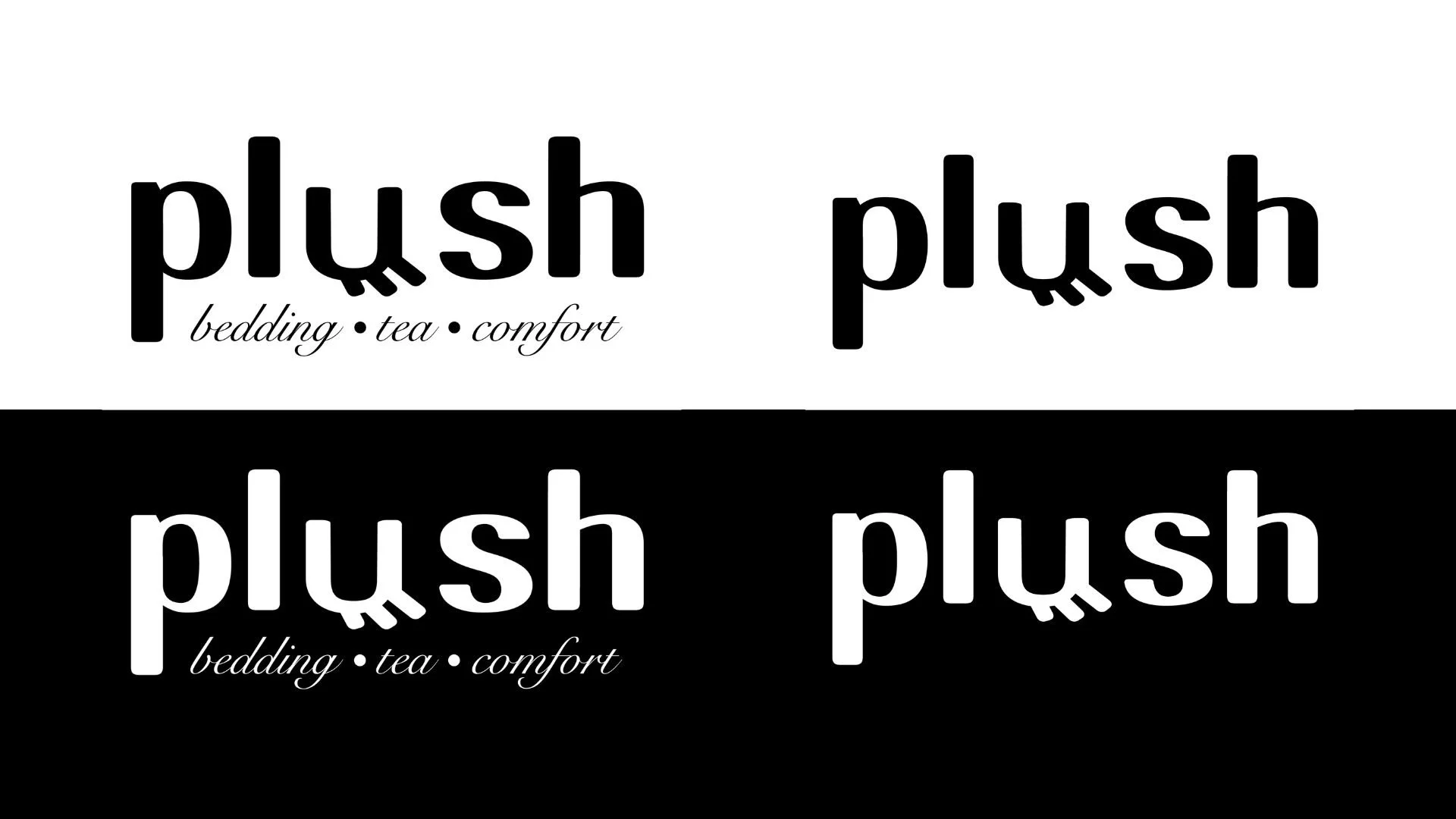
POSITIVE/ NEGATIVE LOGOS
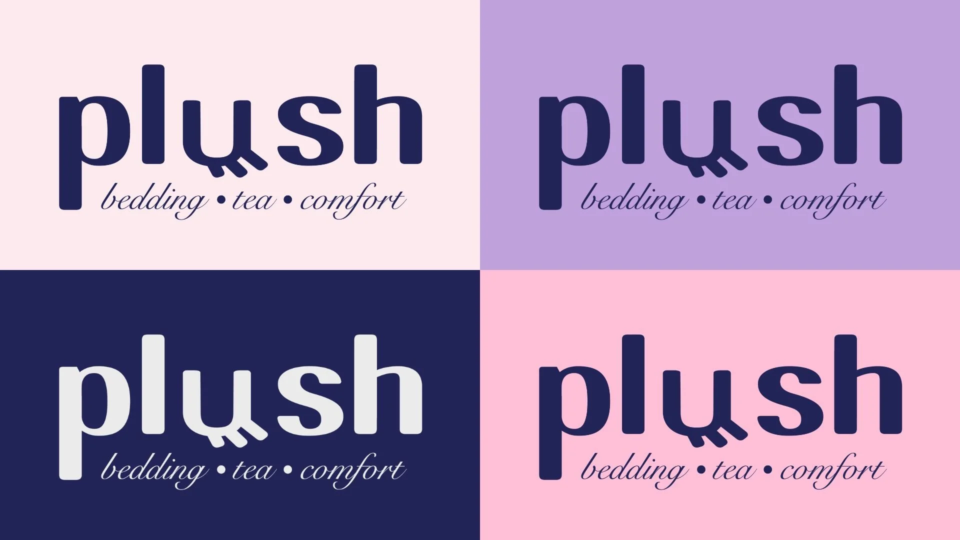
PRIMARY LOGO

SUBMARK LOGOS
Behind the Logo
Plush is a brand concept centered on the idea that rest is essential to success. Quality rest is a fundamental human need, yet in today’s fast-paced world, it often feels like a luxury. The name Plush was intentionally chosen to evoke comfort, softness, and indulgence, reinforcing the idea that everyday rest can and should feel elevated.
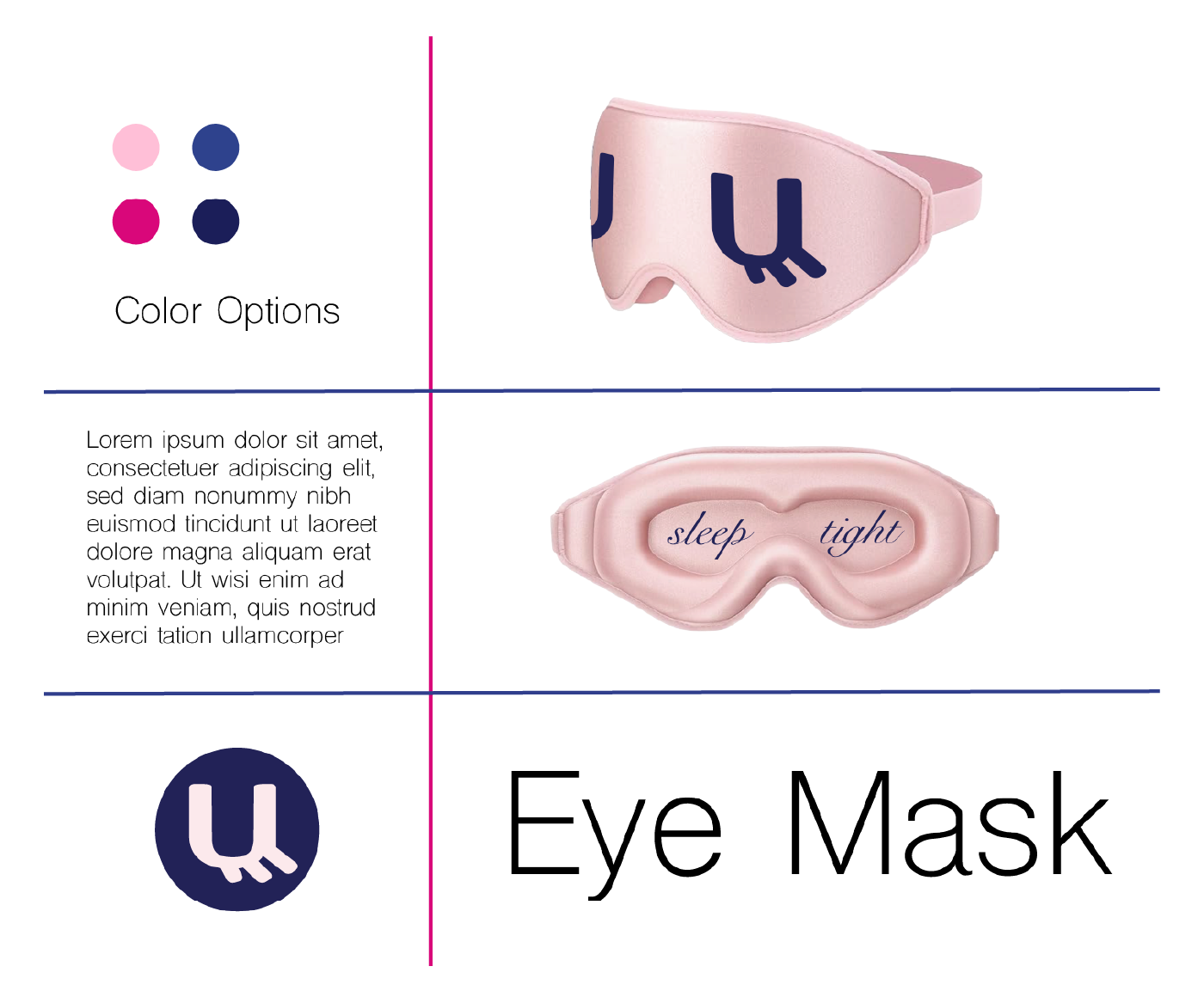
In developing the visual identity, I focused on symbolism that immediately communicates calm and restoration. The primary logo features a closed eye to represent rest and to create a clear, memorable focal point. Supporting identifiers include a sleep mask variation and complementary iconography to enhance brand flexibility across applications.
To further clarify the brand’s positioning, the primary logo is underlined by “bedding - tea - comfort” in cursive to give context to Plush’s core offerings. The overall aesthetic balances a sense of luxury with approachability, resulting in a brand that feels both elevated and inviting.
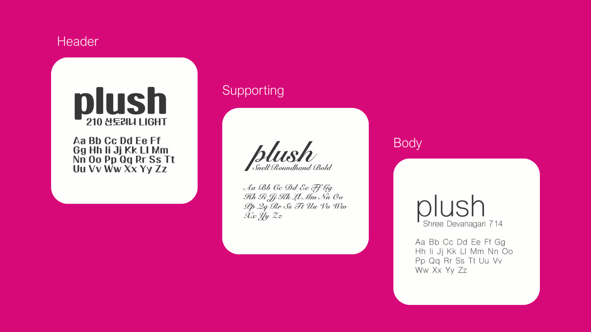
TYPOGRAPHY
PRIMARY COLOR PALETTE
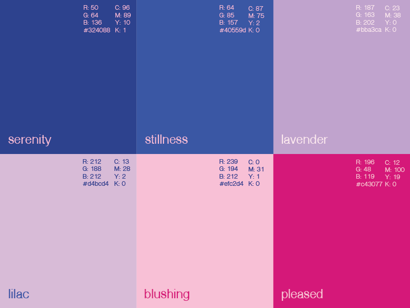
SECONDARY COLOR PALETTE
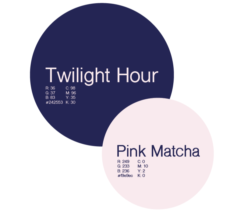
Color Palette
This color palette was chosen carefully to evoke calm confidence. Deep blues like Twilight Hour, Serenity, and Stillness ground the palette with stability and trust, creating a sense of quiet strength and professionalism. Complementing them, lighter tones like Pink Matcha, Lavender, Lilac, and Blushing introduce warmth and approachability, softening the structure with subtle femininity and emotional depth.
Pleased is the vibrant accent color which adds a strategic pop of energy. A perfect color for calls to action or focal moments, without disrupting the overall sense of calm. Together, these hues create a cohesive visual language that feels serene, elevated, and intentional, reflecting my ability as a designer to balance clarity with creativity and emotion with strategy.
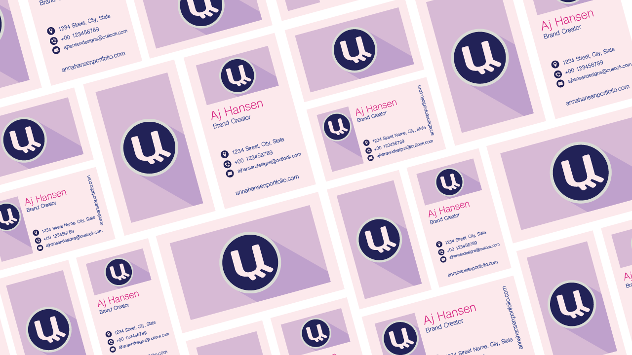
BUSINESS CARD MOCKUP
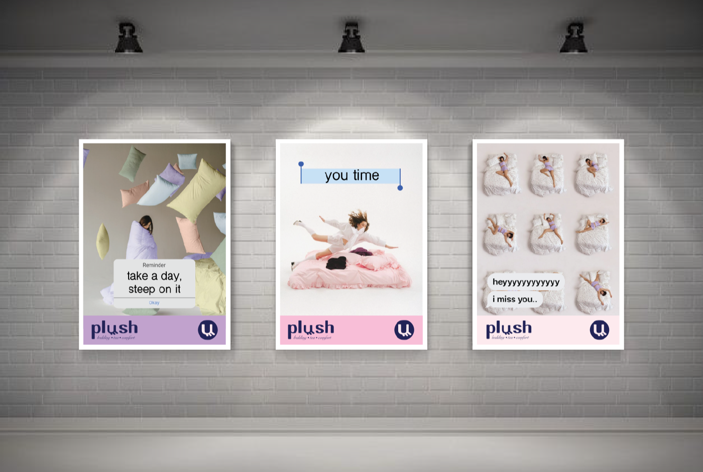
POSTER MOCKUPS
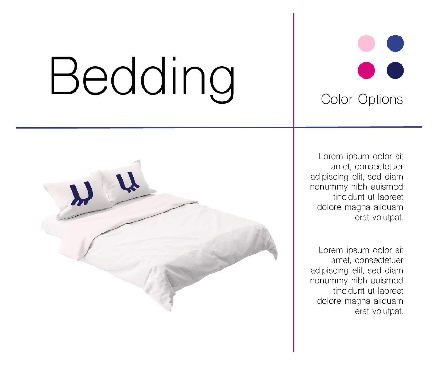
PRODUCT MOCKUP 1
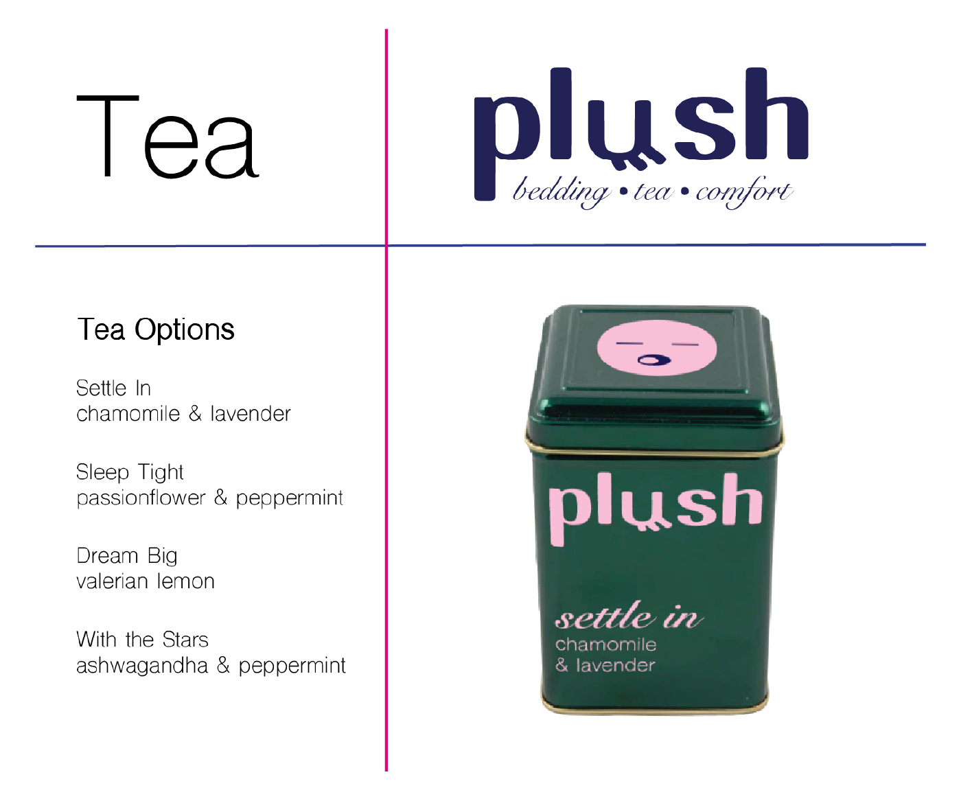
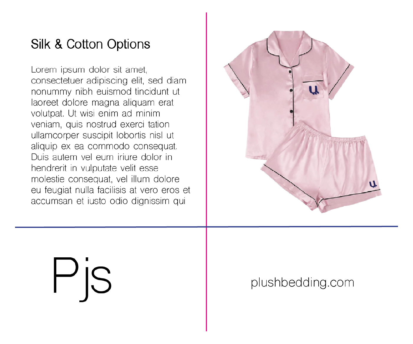
PRODUCT MOCKUP 2
PRODUCT MOCKUP 3
PRODUCT MOCKUP 4
Rules & Lessons
A successful promotion requires clear, powerful communication that brings both the designer and the brand to the forefront. Strong branding should be memorable, timeless, and visually engaging while balancing aesthetics and functionality. For this project, the goal was to create a complete brand packet and style guide that presents a cohesive identity. The finished product includes a cover page, brand introduction, three logo variations (primary, secondary, and positive/negative), a color system, typography, and a design system with logo combinations, and icons. It also includes three or more extensions, including a mandatory poster and additional applications such as packaging.
The project duration was six weeks. During the first week, research was conducted to develop a creative brief that defined the brand’s objectives and target audience. From this process, the slogan “Where rest becomes ritual” was created to reflect the brand’s message. The designs were developed using Adobe Illustrator and Photoshop, allowing for experimentation and refinement throughout the design process.
For my self-promotion branding project, I created Plush, a bedding and tea company centered around relaxation and restorative sleep. The logo features the letter “U” as a closed eye with eyelashes to visually represent the brand’s focus on rest. The color palette combines harmonious tones with a contrasting accent color to maintain balance and visual interest. Soft, elegant typography was chosen to convey a calm and luxurious feeling, and additional assets such as sleepy icons and closed-eye graphics were developed to strengthen the brand identity.
Through this project, I gained valuable experience in building a complete brand identity system and maintaining visual consistency across multiple design elements. It allowed me to practice translating a concept into a fully developed brand with clear messaging and cohesive visuals. I also learned the importance of research, iteration, and thoughtful design decisions throughout the branding process. Overall, this project was an enjoyable opportunity to express creativity while applying professional branding principles.